# Lesson 9 : The VLToolBars
This is the 9th part of the VLDocking Framework for Java Swing applications.
This lessons covers the VLToolBars components, an enhanced version of the classic JToolBar Swing
component.
## What are the VLToolbars ?
### An enhanced JToolBar
The VLToolBar component provides an enhanced user experience for toolbars.

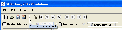
_A set of VLToolBars_

_Same set arranged vetically on two columns_
Many important usability concerns have been addressed :
* A look and feel with an enhanced ("soft") rollover effect
* multiple toolbars can be positionned around a central user component, horizontally, vertically, and on multiple rows and columns
* Drag and drop support adapted to this new layout, with immediate feedback
### Drag and Drop support
A "gripper" at the base of the toolbar can be used as an anchor to drag and drop the toolbar around its container.
### Load and save configuration
As with VLDocking, VLToolBars use an XML format to save and reload their positionning.
## Using VLToolBars
### Installing a toolbar
Here is an image introducing the components in use with VLToolBars :

_An overview of the components_
Installing a set of toolbars is easy :
* create a `ToolBarContainer` (a specialized JPanel with a BorderLayout)
* add you component at the center : container.add(myComp, BorderLayout.CENTER)
* get a reference to a ToolBarPanel from the `ToolBarContainer` : container.getToolBarPanelAt(BorderLayout.NORTH)
* add one or more VLToolBars to it, using the ToolBarConstraints to specify their relative order.
* enjoy the results !
Details of these operations follow.
#### Create a `ToolBarContainer`
The `ToolBarContainer` is a specialized JPanel with a BorderLayout, which can contain up to four sets of toolbars (on every side).
The easiest way to create that container is to use the static method
```java
public static ToolBarContainer createDefaultContainer(boolean topToolbar,
boolean leftToolBar, boolean bottomToolBar, boolean rightToolBar)
```
The four booleans are used to specify the borders used to contain a set of toolbars (you way want to have a toolbar on top and bottom, but not on left and right border).
The central part of the container is dedicated to the user component.
#### Accessing borders and specifying layout constraints
Once the user component and usable borders are specified, you will need to access the border components, which are `ToolBarPanel`s.
A ToolBarPanel is a specialized JPanel with a ToolBarPanelLayout. It can accept components (VLToolBars) and lay them out horizontally or vertically, at different positions.
These positions are specified as `ToolBarConstraints`.
Here is an example of accessing some `ToolBarPanels`.
```java
TooBarContainer container = ToolBarContainer.createDefaultContainer(true, true, true, true);
// top border
ToolBarPanel topPanel = container.getToolBarPanelAt(BorderLayout.NORTH);
VLToolBar toolbar1 = ...
VLToolBar toolbar2 = ...
topPanel.add(toolbar1, new ToolBarConstraints(0, 0)); // first row, first column
topPanel.add(toolbar2, new ToolBarConstraints(0, 1)); // first row, second column
// left border
ToolBarPanel leftPanel = container.getToolBarPanelAt(BorderLayout.WEST);
VLToolBar toolbar3 = ...
VLToolBar toolbar3 = ...
leftPanel.add(toolbar3, new ToolBarConstraints(0, 0)); // first *column*, first row
leftPanel.add(toolbar4, new ToolBarConstraints(0, 1)); // first column,*second row*
```

_The result of the sample code above_
If you look at the sample code above, you will see that we have used the same constraints to specify different layouts. This is because ToolbarConstraints are expressed in terms of *major order* and *minor order*, which are considered differently whether the toolbar is laid out horizontally or vertically.
So here is an expression of the orders depending on the toolbar orientation :

_The major order in an *horizontal* ToolBarPanel is the *row*._

_The major order in a *vertical* ToolBarPanel is the *column*._
#### Major/minor order collapsing
Please note that if a ToolbarConstraints order (major or minor) is too high for the current
contained components, it will be reduced to the next available order.
For example, if you add a toolbar at (0,7) and there are only 2 toolbars (0,0) and (0,1) at this minor order, the constraints will be reduced to (0,2).
#### Adding buttons to a toolbar
This is really simple, you can add() a component, or addSeparator() to add a separator between two buttons.
If the component added is an instance of JButton, it's UI will be adapted to the one in use for the toolbar.
#### Changing the UI for the toolbar
There is currently no UI delegate for the VLToolBar, but it is easy to change its look and feel by subclassing it or
updating its set of ui related properties :
| VLToolBar property | Description | Default Value |
|---|
| isRolloverBorderPainted | paints a rollover border when the mouse is over a JButton | true |
| isRooloverContentAreaFilled | updates the setContentAreaFilled of a JButton during rollover | false |
| isUseCustomUI | if true, replace the JButton ui delegate by a VLButtonUI (provides a soft rounded border) | true |
| draggedBorder | the border used by the toolbar when it is dragged | a ToolBarButtonBorder (soft rounded border) |
You can also update the style of the "gripper" (ToolBarGripper) by replacing its ui delegate : ToolBarGripperUI.
This can be achieved the same way you update the UI delegates of VLDocking :
* Install the default settings by calling `DockingUISettings.getInstance().installUI()`
* replace the ui property with `UIManager.putProperty("ToolBarGripperUI", "your.ui.delegateClassName");`
(you will have to do this prior VLToolBar install, otherwise your settings might be ignored).
### The Collapsible toolbars
VLDocking 2.0.6 introduces a new UI enhancement : Collapsible toolbars.

_A normal set of toolbars_
_Same set, but the middle toolbar has been collapsed_
Collapsing is enabled by default (you just have to click on the toolbar gripper), if you want to disable this feature, just call `toolbar.setCollapsible(false)`.
You can also trigger collapsing by the API : `toolbar.setCollapsed(boolean collapsed)`
## Reading and writing
To load and save your toolbar positions, use the dedicated call `ToolBarIO`,
with the `readXML(InputStream)` and `writeXML(OutputStream)` methods.
This will create (or read) an XML output (input) containing the name of the toolbars and their ToolBarConstraints,
the stream will not be closed to allow you to write (read) more data into (from) it.
### Creating an XML output
Here is the way to go :
* You must have a valid `ToolBarContainer` containing a set of VLToolBars
* The toolbars must have a name (you can use the `setName` of the JComponent class
To set a different name for each toolbar
* The toolbars must have been registered and added to the container (`container.registerToolBar(VLToolBar tb)` )
* create a new ToolBarIO for this container
* invoke writeXML on this utility class.
And here is a example :
```java
// create and install the container
ToolBarContainer container = ToolBarContainer.createDefaultContainer(...);
// create and register your toolbars
VLToolBar tb1 = new VLToolBar("tb1");
VLToolBar tb2 = new VLToolBar("tb2");
VLToolBar tb3 = new VLToolBar();
tb3.setName("tb3"); // alternative way of giving a name to a toolbar
container.registerToolBar(tb1);
container.registerToolBar(tb2);
container.registerToolBar(tb3);
// install the toolbars where you want
container.getToolBarPanelAt(BorderLayout.NORTH).add(tb1, new ToolBarConstraints(0, 0));
container.getToolBarPanelAt(BorderLayout.NORTH).add(tb2, new ToolBarConstraints(0, 1));
container.getToolBarPanelAt(BorderLayout.SOUTH).add(tb3, new ToolBarConstraints(0, 0));
// save them as XML
ToolBarIO tbIO = new ToolBarIO(container);
OutputStream out = ...
tbIO.writeXML(out);
// the end (note that the stream is not closed)
```
### Reading a configuration from XML
Here is the way to go :
* You must have a valid (empty or not)`ToolBarContainer`
* The toolbars must have a name (you can use the `setName` of the JComponent class
to set a different name for each toolbar
* The toolbars must have been registered to the container (`container.registerToolBar(VLToolBar tb)`) but not necessarily be visible
* create a new ToolBarIO for this container
* invoke readXML on this utility class.
And here is a example of reading :
```java
// create and install the container
ToolBarContainer container = ToolBarContainer.createDefaultContainer(...);
// create and register your toolbars
VLToolBar tb1 = new VLToolBar("tb1");
VLToolBar tb2 = new VLToolBar("tb2");
VLToolBar tb3 = new VLToolBar();
tb3.setName("tb3"); // alternative way of giving a name to a toolbar
container.registerToolBar(tb1);
container.registerToolBar(tb2);
container.registerToolBar(tb3);
// install them from XML
ToolBarIO tbIO = new ToolBarIO(container);
InputStream in = ...
tbIO.readXML(in);
// the end (note that the input stream is not closed)
```
*Note* : the contents of the toolbars are not saved, it's up to you to add your
buttons before (or after) calling ToolbarIO.readXML(). Otherwise you will have a
well placed set of ... empty toolbars.
### Autosave and install of toolbars with `ToolBarPersistence`
Coming with VLDocking 2.0.6, this component can be used to automate the process of loading
and saving toolbar configations as java.util.preferences (warning : the API doesn't work
on sandboxed environments (e.g. in unsigned Java Web Start application).
Using this class is easy : you create a new instance for each toolbar container,
and the installation of toolbars is automated (no need to use the readXML() method anymore).
Saving is also automated as a shutdown hook : at restart, the user
will get the same set and positionning of toolbars for this container.
## The BackgroundPainter API
This small API can be used to replace the default look and feel background for toolbars panels.
The API is based on a very simple interface `BackgroundPainter` that can be shared between components.
Here is an example of a painter using a SwingX Gradient :
    import org.jdesktop.swingx.painter.gradient.BasicGradientPainter;
    import com.vlsolutions.swing.toolbars.BackgroundPainter;

    // declare
    public class CustomBackgroundPainter extends BasicGradientPainter
                   implements BackgroundPainter {

        public CustomBackgroundPainter() {
            super(BasicGradientPainter.GRAY);
        }

        /** BackgrounPainer interface impl */
        public void paintBackground(JComponent component, Graphics g) {
            super.paintBackground((Graphics2D) g, component);
        }
    }
Then you just have to transmit it to a ToolBarPanel :
```java
ToolBarPanel topPanel = container.getToolBarPanelAt(BorderLayout.NORTH);
topPanel.setOpaque(false);
topPanel.setPainter( // set a custom background painter
new CustomBackgroundPainter());
```
Easy, isn't it ?
----
Next : [Lesson 10 - Compound dockables](tutorial10)