CSS implementation of Spirit Design System.
yarn add @lmc-eu/spirit-webor
npm install --save @lmc-eu/spirit-webThe pre-built Spirit CSS is a great choice for small one-off projects, prototypes and documentations.
Link the full, vendor-prefixed and minimised CSS with default Spirit branding in your HTML template:
<link rel="stylesheet" href="https://fonts.googleapis.com/css2?family=Inter:wght@400;600;700&display=swap" />
<link rel="stylesheet" href="node_modules/@lmc-eu/spirit-web/css/components.min.css" />
👉 Alternatively, you can use CDN links when you don't want to install any npm packages.
❗ Important: Make sure you have sass dependency installed in your project (sass is marked as optional peer dependency since you can use the pre-built distribution CSS).
And also configure Sass load path for @tokens and
node_modules so all dependencies are resolved correctly by Sass.
Having the Sass load path configured, import just the components you need in your Sass stylesheet:
@use 'node_modules/@lmc-eu/spirit-web/scss/components/Button';You can add prefixes to CSS class names to better separate Spirit from other CSS
in your project. The recommended way is using PostCSS with the
postcss-prefix-selector plugin:
// postcss.config.js

const postcssPrefixSelector = require('postcss-prefix-selector');

module.exports = {
  plugins: [
    postcssPrefixSelector({
      prefix: 'spirit-',
      transform(prefix, selector) {
        // Ignore interaction state classes controlled by JS: .is-* | .has-*
        const regex = /\.(?!is-|has-)/gi;
        return selector.replaceAll(regex, `.${prefix}`);
      },
    }),
  ],
};Some components require JavaScript plugins for their full functionality. You can use individual modules or compiled bundle.
Plugins can be included individually as an EcmaScript module (using import { <plugin> } from '@lmc-eu/spirit-web', see Using Spirit Web as a module), or all at once using js/{cjs|esm|bundle}/spirit-web.js or the minified js/{cjs|esm|bundle}/spirit-web.min.js (do not include both), all files are UMD ready.
<script src="node_modules/@lmc-eu/spirit-web/js/cjs/spirit-web.min.js" async></script>If you use a bundler (Webpack, Rollup, ...), you can use /js/*.js files which are EcmaScript modules.
We provide a version of Spirit Web as ESM (spirit-web.esm.js and spirit-web.esm.min.js) which allows you to use Spirit Web as a module in your browser.
<script type="module">
  import { Header } from 'spirit-web.esm.min.js';

  Array.from(document.querySelectorAll('.header')).forEach((headerNode) => new Header(headerNode));
</script>Nearly all Spirit-Web plugins can be enabled and configured through HTML alone with data attributes (our preferred way of using JavaScript functionality). Be sure to only use one set of data attributes on a single element (e.g., you cannot trigger a tooltip and modal from the same button.).
ℹ️ For turning off this functionality just do not set the data-spirit-toggle attribute and use the Programnatic API.
Currently to query DOM elements we use the native methods
querySelectorandquerySelectorAllfor performance reasons, so you have to use valid selectors. If you use special selectors, for example:collapse:Examplebe sure to escape them.
Spirit-Web provides custom events for most plugins' unique actions.
Generally, these come in an infinitive and past participle form - where the infinitive (ex. show) is triggered at the start of an event, and its past participle form (ex. shown) is triggered on the completion of an action.
All infinitive events provide preventDefault() functionality.
This provides the ability to stop the execution of an action before it starts.
Returning false from an event handler will also automatically call preventDefault().
var myModal = document.getElementById('myModal');

myModal.addEventListener('show.modal', function (event) {
  if (!data) {
    return event.preventDefault(); // stops modal from being shown
  }
});var myModalEl = document.getElementById('myModal');
var modal = new Modal(myModalEl); // initialized with defaultsIf you’d like to get a particular plugin instance, each plugin exposes a getInstance method.
You can also use a CSS selector as the first argument instead of a DOM element to initialize the plugin.
Currently the element for the plugin is found by the querySelector method since our plugins support a single element only.
var modal = new Modal('#myModal');
var dropdown = new Dropdown('[data-spirit-toggle="dropdown"]');Spirit Design System is also available on CDN:
👉 Consider using a specific version instead of latest in production.
Design tokens and their @tokens API enable quick and easy
rebranding of Spirit Sass components and styles. Once you have created your own
design tokens, just provide them to your Sass compiler and you are ready to go!
Learn more in the spirit-design-tokens docs.
Start local development server with yarn start to get started. You will get the live preview of all components and plugins in your browser. Just get dirty and change something and you will see the changes live.
The dev-stack is based on Vite.
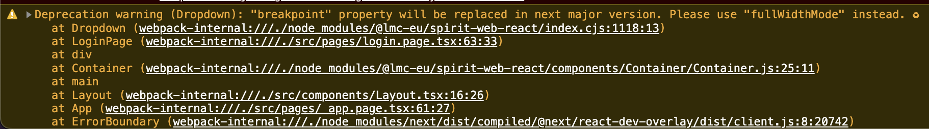
This package uses the deprecation warnings for props, functions and components that will be removed or replaced in the next major release. Check your browser console to see if you are using any of the deprecated functionality.
This package uses feature flags to enable or disable some functionality. You can enable or disable them by loading
the feature-flags module with a configuration. You have to do this before loading any other Spirit Web SCSS file.
Example with fictional feature flag to enable fullscreen modal:
@use '~@lmc-eu/spirit-web/scss/settings/feature-flags' with (
  $modal-enable-fullscreen: true
);

@use '~@lmc-eu/spirit-web/scss/foundation';
// …
Every feature flag should also provide a class selector that can be used to enable or disable the feature. You can use this class if you want to limit the usage of the feature to a specific part of your application. Place the class on any parent element of the component you want to enable the feature for.
Example:
<body class="spirit-modal-enable-fullscreen">
  <!-- … -->
  <div class="Modal">
    <!-- … -->
  </div>
</body>👀 See examples for a live demo.
See the LICENSE file for information.