You signed in with another tab or window. Reload to refresh your session.You signed out in another tab or window. Reload to refresh your session.You switched accounts on another tab or window. Reload to refresh your session.Dismiss alert
{{ message }}
This repository has been archived by the owner on Jul 26, 2018. It is now read-only.
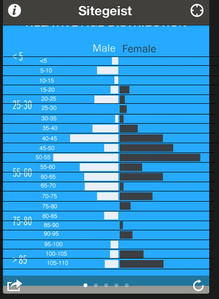
Multiple users have shared feedback that the "Relative Age Distribution" section under People is confusing. The app currently displays only five labels for ages with huge gaps. For example, one user asked if we were missing the 31-54 age bracket. There is also an issue with alignment where the label covers multiple bars.
Here's the labeling from the U.S. Census Bureau data for each bar in the app:
Obviously this example is not a solution, but it's clear that this section could use some design improvements so users are not confused.
The text was updated successfully, but these errors were encountered:
Sign up for freeto subscribe to this conversation on GitHub.
Already have an account?
Sign in.
Multiple users have shared feedback that the "Relative Age Distribution" section under People is confusing. The app currently displays only five labels for ages with huge gaps. For example, one user asked if we were missing the 31-54 age bracket. There is also an issue with alignment where the label covers multiple bars.
Here's the labeling from the U.S. Census Bureau data for each bar in the app:

Obviously this example is not a solution, but it's clear that this section could use some design improvements so users are not confused.
The text was updated successfully, but these errors were encountered: