-
Notifications
You must be signed in to change notification settings - Fork 821
New issue
Have a question about this project? Sign up for a free GitHub account to open an issue and contact its maintainers and the community.
By clicking “Sign up for GitHub”, you agree to our terms of service and privacy statement. We’ll occasionally send you account related emails.
Already on GitHub? Sign in to your account
Changing farmland and societal amenities colors #3327
Conversation
This is essentially a color swap with societal_amenities plus a bit of
tuning.
|
This makes a lot of sense. I like how this takes schools out of yellowish/green and puts it closer to amenity brown (it almost looks as if school text could actually be @amenity_brown instead of a darkened version of the landcover). |
|
Thanks for reminding of labels. I'm not sure where to change the color of school name, but farmland name will look like this: |
|
Looks encouraging to me on my first impression. |
There was a problem hiding this comment.
Choose a reason for hiding this comment
The reason will be displayed to describe this comment to others. Learn more.
I won't have time to do a cartographic review.
| @farmland: #fbecd7; // Lch(94,12,80) | ||
| @farmland-line: #d6c4ab; // Lch(80,15,80) | ||
| @farmland: #eef0d5; // Lch(94,14,112) | ||
| @farmland-line: #c7c9ae; // Lch(80,14,112) |
There was a problem hiding this comment.
Choose a reason for hiding this comment
The reason will be displayed to describe this comment to others. Learn more.
We generally go for a bit more chroma on the lines.
There was a problem hiding this comment.
Choose a reason for hiding this comment
The reason will be displayed to describe this comment to others. Learn more.
What's your proposition then?
There was a problem hiding this comment.
Choose a reason for hiding this comment
The reason will be displayed to describe this comment to others. Learn more.
What do you think about #3327 (comment)? I can't see the difference.
|
This makes it harder though to tell apart farmland from other landuse in the countryside. After all, the different colors are there for distinction, not to mimik the colors of how it would look on a satellite image. "Freeing up" a color for use in urban parts removes this color for use in rural parts. |
|
Why do you think it makes it harder exactly? The colors are still different and the luminocity is similar. I didn't think about aerial images - there's no single color for farmland (different phases of growth, different species). There's no freeing up any color, there's only a color swap. |
|
Adding more chroma for farmland outline: @imagico version |
|
The current color reminds me of the warm golden color of cereal, that's why I prefer it in favour of the new suggested color. But, maybe the current version is too "bright", and I understand that there is a will or need for change, but the new suggestion looks too much like "military-green" and the map already has quite many greenish color styles. |
|
I'm still not convinced of your suggestion, but still - maybe the current "farmland gold" is too bright, I'm not sure about that... |
|
So what would be your suggestion to make it less bright? |
|
Just a thought: how does the new colour look beside |
|
I was worried it would look wrong, but that's not as bad as I was expecting |
|
About the "brightness" of the current color: If others feel or felt the same, this could lead to a "tagging for the renderer" and that would just be bad... After starting the thought, that the current farmland color is something like " ready to harvest crop plants" I perfectly learned to live with it, and I like it now. I find the other color styles (old-osm, fr, de) better then the [edit: current one on osm]. I can understand the want for a change (especially if the current color would lead to a "tagging for the renderer"). I'm really bad in deciding such things - but I still oppose a greenish color style... |
|
It's interesting what you say - I have never tried tagging farmland for renderer even if it was (and still is) not nice for me and I wanted to get rid of it. I also think that using similar color shades for vegetation makes sense. Moving things toward consistency is important, and the best example lately is playground color change: without #2249 inventing #3330 would be rather hard, even if nobody expected that we might start rendering ice rinks one day. I'm cautious and don't trust making the big system at this stage of style development (which is good idea when starting new project), but not only it makes farmland vegetation-like, also it makes societal amenities closer to other landuses. |
|
Another thought why not to use a "greenish" color style: Areas with "landuse=farmland" are "economically utilized/exploited". So this areas also have something in common with commercial/industrial areas. Edit: But that is also true for almost all European forest areas... |
|
@kocio-pl was there ever a discussion about what kind of landuses get special colors versus a pattern? I notice orchards along with vineyards are both dark green and have a pattern. Maybe farmland is to general for a pattern, but it seems a little off to make it a completely different color then its sub types. I can see there being a lot more crop types with patterns in the future. Maybe how they would play into the general farmland tag as a cohesive whole is something to consider in tandem with this issue, if not how the current ones do at least. I almost agree with @hubgitti that maybe there should be a economically utilized/exploited scheme or at least one for the category of "agriculturally" used land. Otherwise it risks way over complicating things. |
|
Distinguishing crop types was discussed, maybe here or on the tagging list. The problem is that they can change quite often for the same field. I browsed the thread here again and still like the change. As for the farm yard, maybe that could be even lightened up a bit in the new context? Could we see a village with a school, farm yard and farm land? |
I don't think so. Some landuses were here from the beginning (in pre-2012 XML style probably).
Well, being green(ish) makes it closer to them than currently.
Forest is for "managed" tree areas and it might be exploited, yet it would not work for me to try to depict this aspect. There is a general guideline to use regular patterns when something is curated and irregular ones for more natural objects, but it'd be hard to enforce it universally, it just provides a hint. |
I could not find them too close to each other, but here is an example: |
|
sent from a phone
On 25. Aug 2018, at 12:46, polarbearing ***@***.***> wrote:
Distinguishing crop types was discussed, maybe here or on the tagging list. The problem is that they can change quite often for the same field.
I guess it depends how we define the classes. We would not distinguish between wheat, barley or maybe maize, but between those and rice, or hops, yes (for example). Similar to how orchards are distinguished from farmland. Meadows and farmland on the other hand do alternate in areas I know of, and there is indeed the problem you have to change it “frequently”
|
|
If we have only the basic set of tags to render, it would be different, I would probably think about colors case by case (however this shade is too intensive anyway for me). This map is much more complex and more systematic approach is important. |
Please remember it is a map and not a satellite image painting, and even cereals would start as green plants before being ripe. |
|
Sorry, intuitive color styles clearly is not "satellite image painting". But more important to me: Farmland should be clearly distinguished from other landuses like meadow, or natural areas like grassland, ... Think of the huge farmland areas in Germany, Ukraine, ... |
|
Please look at the comparison with other green areas then (from #3327 (comment)) - I have no problem with seeing the difference with any other green here - do you?: |
|
The new colour is even more intuitive to me, as it is a greenish tone for vegetation, and I can clearly distinguish it from the other greens used for grassy/woody things. |
|
I clearly can see the difference, but that is not the point for me. Farmland is - to me - something completely different to grassland, meadow, ... Farming can be like quite "industrial" work. |
|
That is probably really a bad idea, what's about your greenish style plus a symbol like forests have? |
|
Guys, I will stop opposing your idea (I personally still do not agree with you at this point) but the progress on the map by each version is amazing. The people contributing here seem to know quite well what they are doing, that's why I could be wrong with my opinion here... |
|
Thank you for this change. I believe this would help myself and fellow mappers. The lighter, slightly greenish farmland/cropland color makes more sense as a subclass of "vegetated areas"; lighter than heath or meadow but still more natural appearing. Seeing that meadow, hayfields, pasture and crops can be interchanged on many types of farms, it makes sense that the rendering should be more similar. The farmland color is light enough that is still easily distinguished from the other greens. I also like that amenities will now be more noticable. Re: the outlines. Is it necessary to render an outline for farmland areas? In many places around my town, I've cut up larger areas of farmland so as to avoid making complex multipolygon relations (for example, when a hamlet or wood is surrounded by farmland on all sides), and there are only footpaths in the area, no roads. The divisions between fields are quite noticable. It seems to me they shouldn't be rendered if there is no fence or hedge between fields. For example, water areas, grasslands and woods do not seem have an outline, to avoid this problem. Do the outlines encourage people to merge areas of farmland into larger closed ways? Is that what we want from a data standpoint? I would think that in the future, if separate types of cropland are rendered (like rice paddies vs row vegetables vs grain fields), they could be shown by different patterns, without needing outlines. The lack of outlines could also encourage mappers to add tags for fences or hedges when they are present, in areas where these are present. |
|
It's hard for me to answer, I'd like to hear more farmland mappers to know how they think about it. I think that maybe outlines could be useful for showing real farmlands instead of big landuse-like clusters, which are just easier to draw. |
|
sent from a phone
On 28. Aug 2018, at 03:25, jeisenbe ***@***.***> wrote:
Re: the outlines. Is it necessary to render an outline for farmland areas? In many places around my town, I've cut up larger areas of farmland so as to avoid making complex multipolygon relations (for example, when a hamlet or wood is surrounded by farmland on all sides),
We’ve started mapping these rural areas far more detailed than this around here, meaning that the single object is small, and many of them are needed to surround a hamlet or wood.
Multipolygon relations are never needed, but they are helpful to reduce overlapping ways by reusing the polygon borders.
The structure of divisions is generally interesting on its own, that’s why the outlines are nice to have.
there are only footpaths in the area, no roads.
not even tracks?
|
|
The outlines should encourage people to map according to the real boundaries of a field an not make arbitrary cuts. Then it can help to see e.g. if the village has lots of small fields, or huge monocultures. |
|
dieterdreist, my town is surrounded by farming areas where people only use walking for transportation. There are a handful of roads, but they soon end. However, I've now checked and it looks ok to split a field along a footpath, as long as I am careful to follow the same line, so I think I have a solution. |
|
My current plan is to merge it in a few days without changing outline color, because @pnorman did not answer, I see no difference and 2 people gave their thumbs down. |
ca6ccc1 to
384c017
Compare
|
Thanks, all! You might be interested in the changes @imagico made recently with rendering crop in his fork (which is next step following introducing this farmland color): http://blog.imagico.de/more-on-pattern-use-in-maps/ If anybody wants to discuss it, please open new ticket. |
|
Now the change has been rolled out I can see this has a great effect. Thanks to all involved! |
|
I like it, too! :-) |
Now a farmyard surrounded by farmlands looks way out of place... if it could be made the same hue again that'd be great. |
|
We've found that it's quite OK and there are other problems to solve, so it's not changed. Do you have a proposition which colors we could test? That would help a lot. |







Closes #2821
Changes proposed in this pull request:
In short, this makes basically a color swap between farmland and societal amenities, in effect:
Farmland color comparison between different forks:

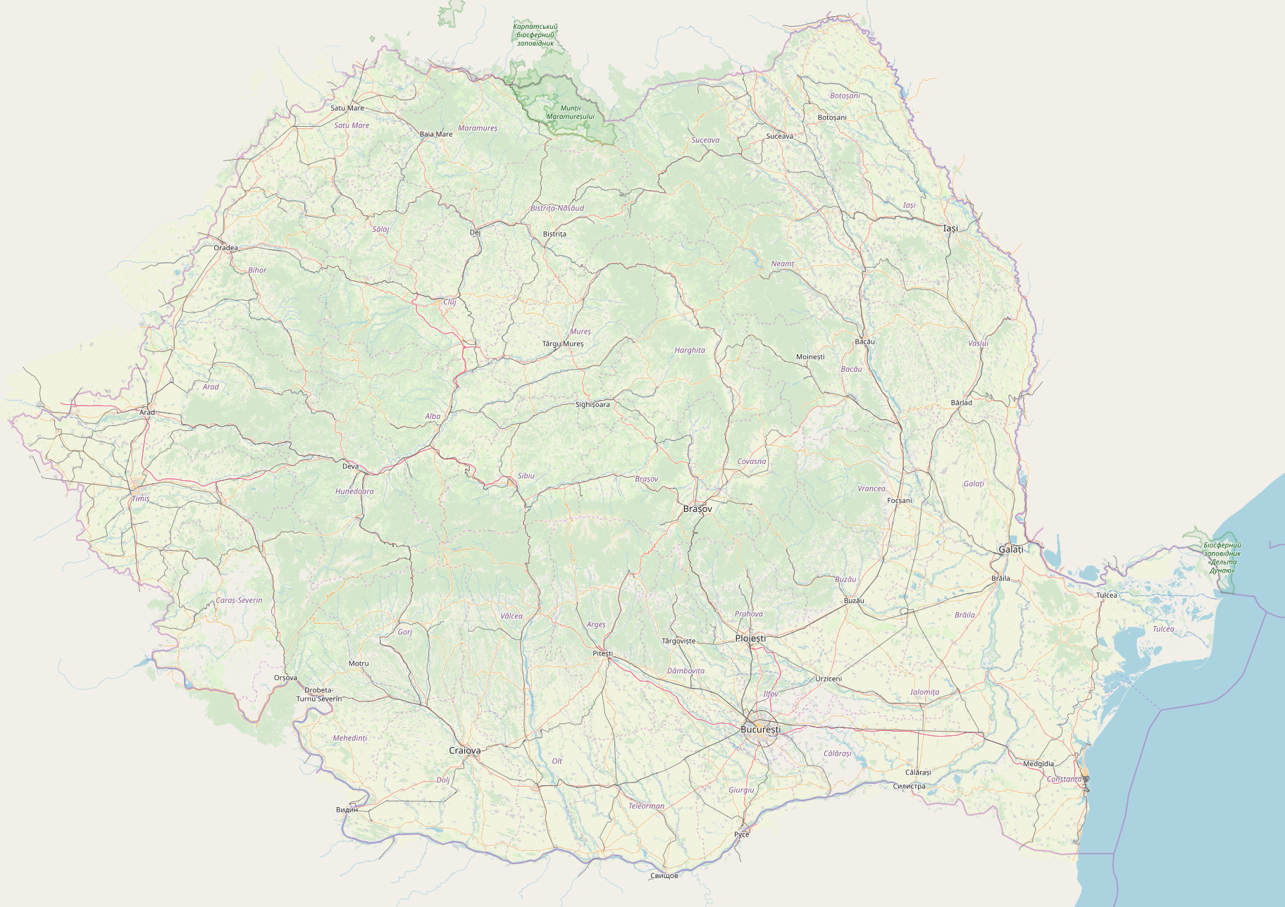
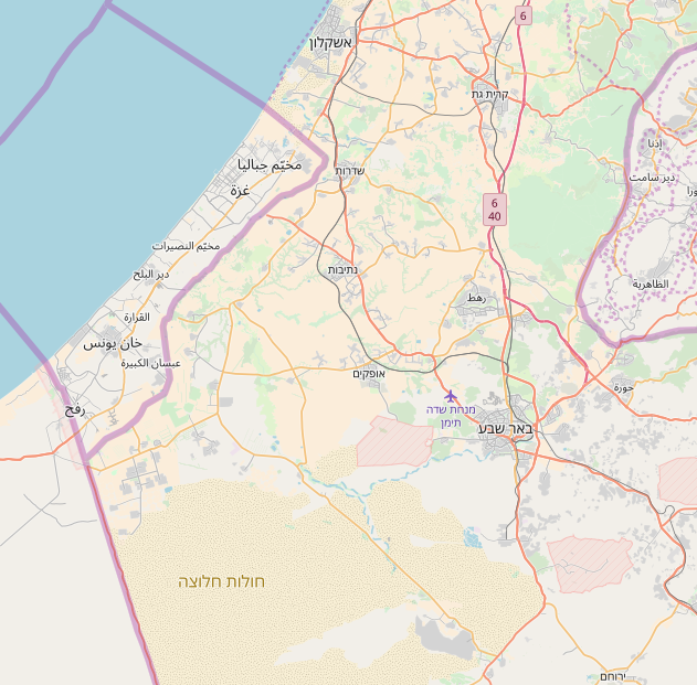
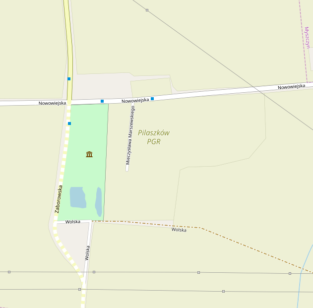
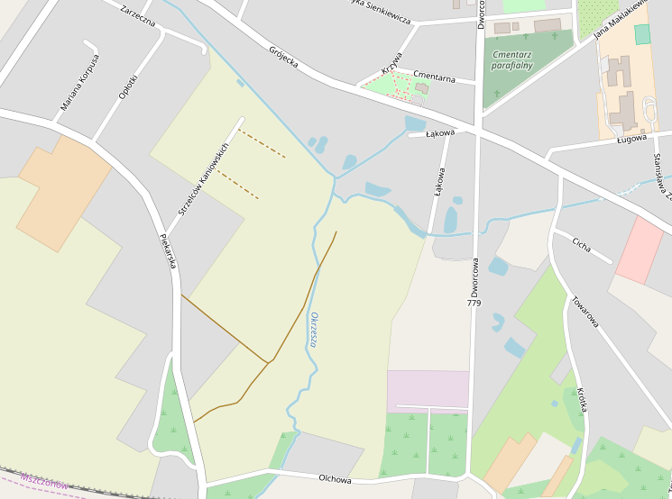
Test rendering with links to the example places (click images to see the full scale):
Poland
Before

After

Comparison with some other green areas
Before
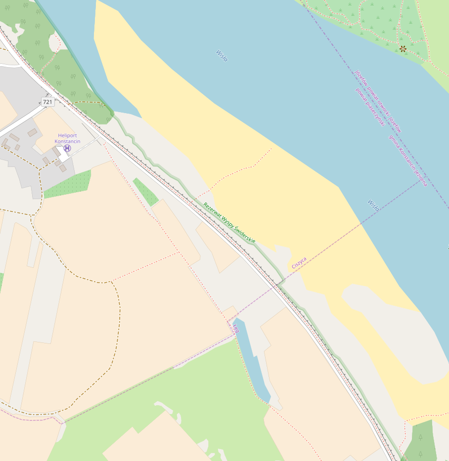
After

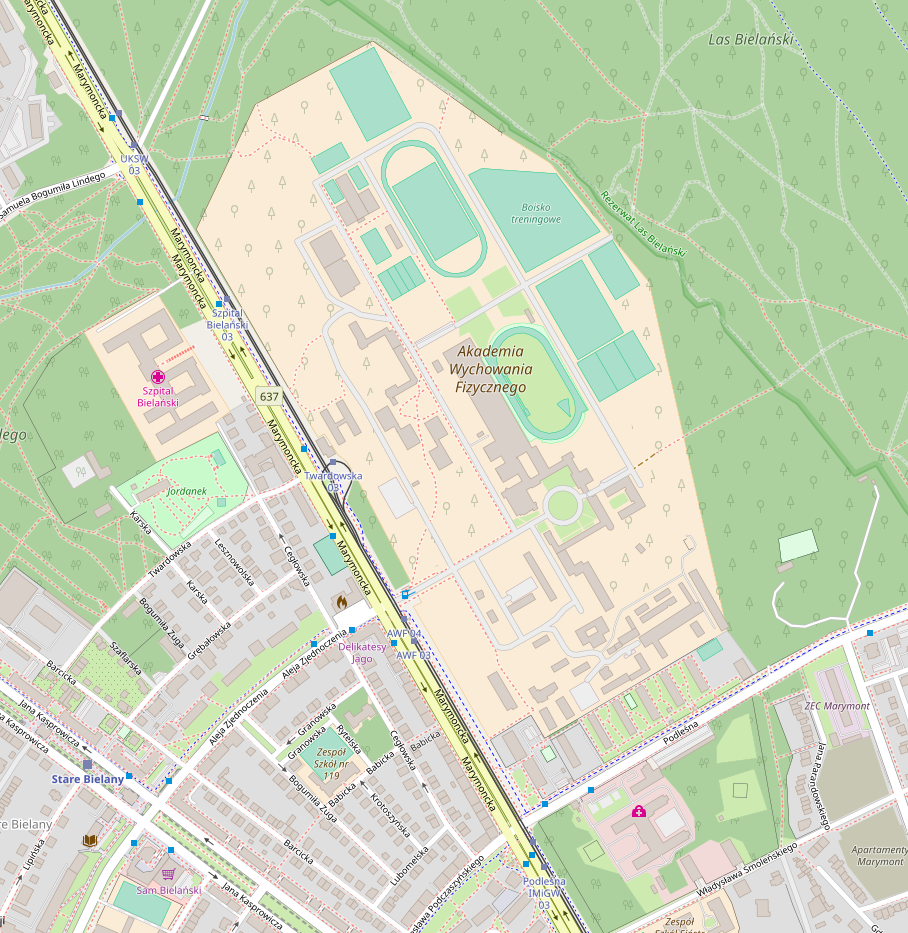
Color change for schools and hospitals
Before
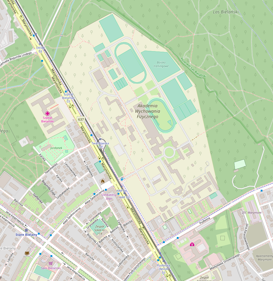
After
Color switch between social facility and farmlands
Before
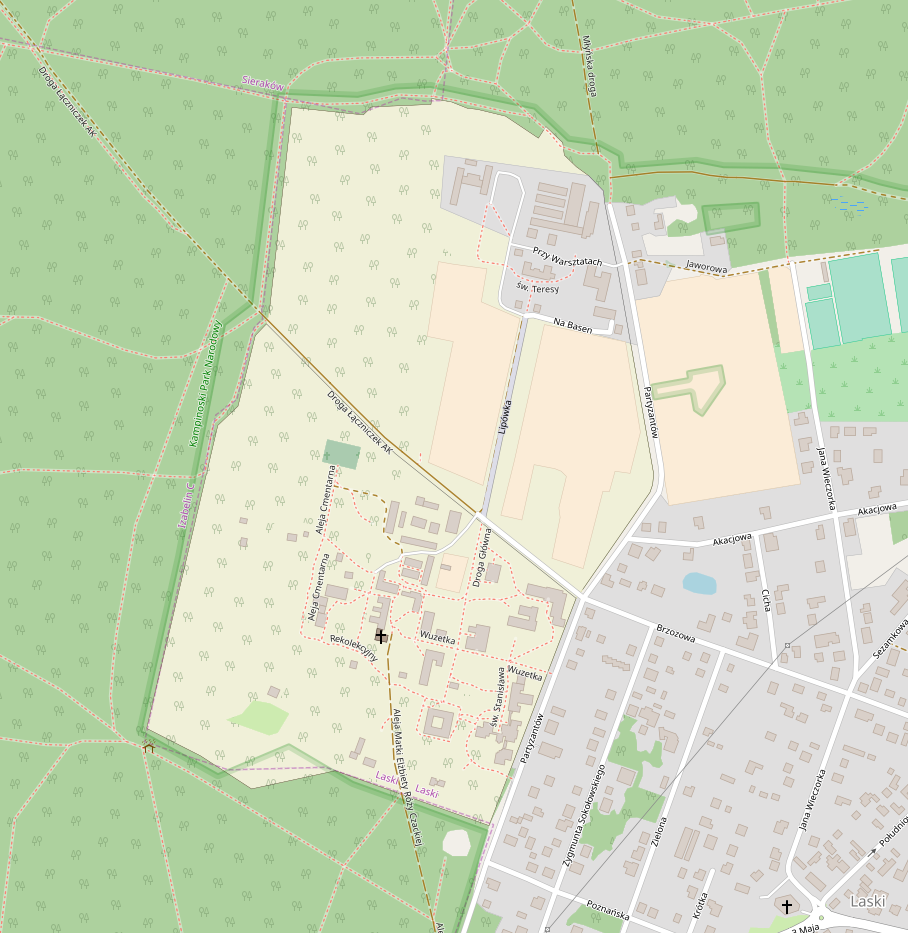
After
