Jumpstart your online presence with this pre-built website template. Easily create a professional-looking business card or link-in-bio page to share everything you want your audience to know.
Demo: morewings.github.io/next-card/
First step, click the 'Use this template' button. It will offer you to clone the repository to your account.
Second, change ./next.config.js to contain your chosen repository name. This is needed for GitHub pages or other non-index page deployment.
/** @type {import('next').NextConfig} */
module.exports = {
// ...
basePath: '/your-repository',
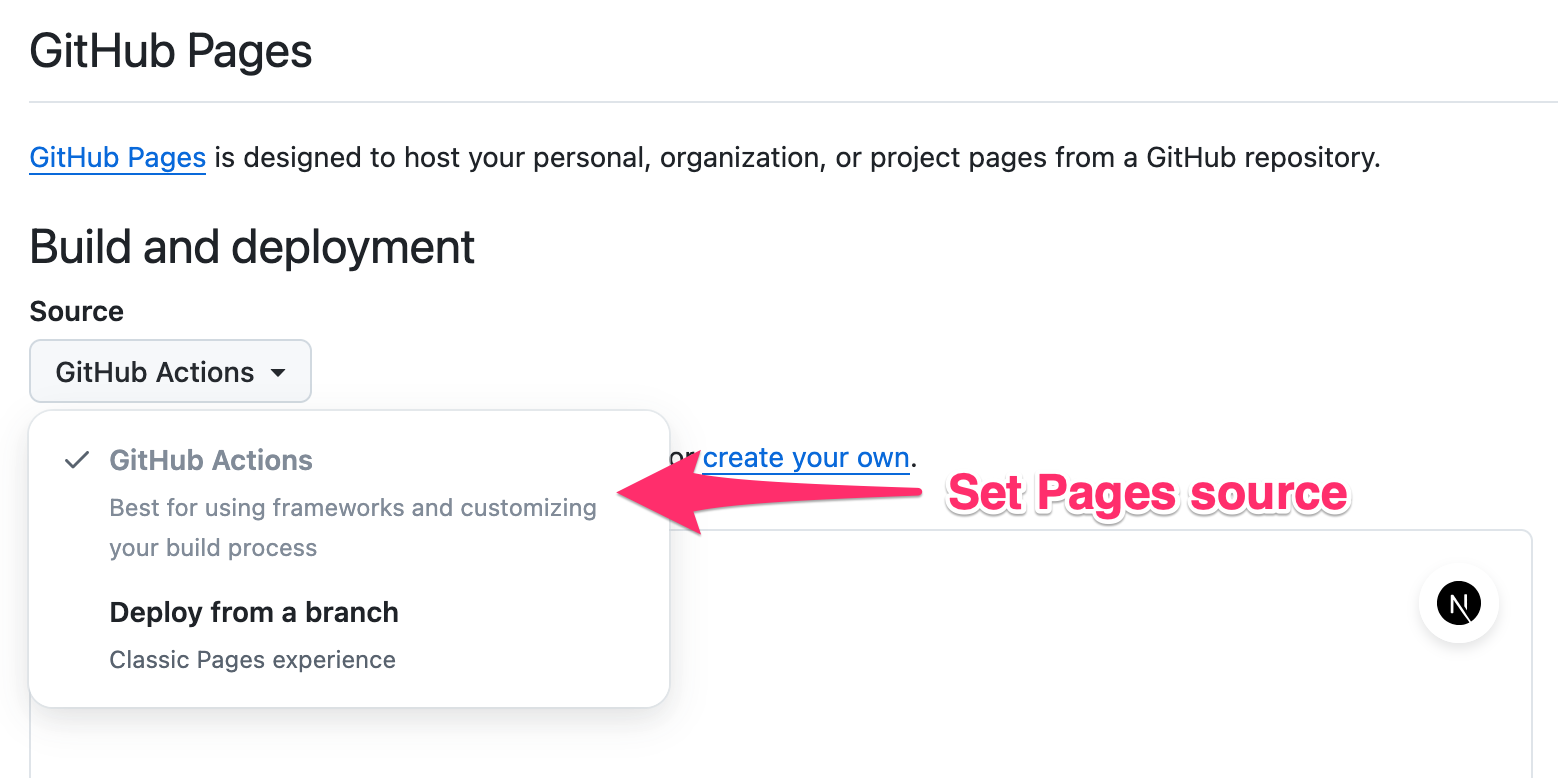
};Go to Settings > Pages section and enable deployment via GitHub action.
Now you'll have to replace ./card-image.jpg with your picture and enter your data into ./config.ts.
Here are the available settings:
-
title: Set your or company name. -
bio: Add a brief description to display below the name. -
background: Select a background style. There are 12 different styles available: fresh, strict, bold, gradient, rainbow, rastafari, sunset, elegant, selenium, evening, optimistic, mesh. See below. -
cardImage: Set the image to be used at the header of the card. -
gaId: Set your Google Analytics ID to enable tracking. More later. -
shareTitle: Localize the sharing text.
import image from '@/card-image.jpg';

export const config: Config = {
    title: 'Patrick Bateman',
    bio: 'Specialist in mergers and acquisitions',
    background: 'gradient',
    cardImage: image,
    gaId: 'G-XXXXXXXXX',
    shareTitle: 'Share link',
    // ...
}In the same file, ./config.ts fill headerLinks array with your contact info links and set up your hero links at the mainLinks section of the config.
Each entry consists of title: the display name of the link; id: a unique identifier for the link; url: The URL the link points to; icon: an icon to be displayed with the link. You can use any icon from the Phosphor icons collection.
import {
    Envelope,
    GithubLogo,
} from '@phosphor-icons/react/dist/ssr';

export const config: Config = {
    // ...
    headerLinks: [
        {
            title: 'Email',
            id: 'email',
            url: 'mailto:[email protected]',
            icon: Envelope,
        },
    ],
    mainLinks: [
        {
            id: 'github',
            title: 'GitHub',
            url: 'https://github.com/user-name',
            icon: GithubLogo,
        },
    ],
}A vCard, also known as a VCF (Virtual Contact File), serves as a standardized file format for electronic business cards. This file can be attached to your link in bio, allowing visitors to easily import your contact info into their smartphones, Outlook, and other calendar applications without having to copy/paste. You can configure this at ./config.ts. You can also enable isOrganization to display contact as a company.
export const config: Config = {
    // ...
    vCard: {
        firstName: 'Patrick',
        lastName: 'Bateman',
        organization: 'Pierce & Pierce',
        title: 'Vice President',
        birthday: new Date(1961, 9, 23),
        workPhone: '+1 212 555 6342',
        email: '[email protected]',
        // isOrganization: true,
    },
}Commit your changes, push to the main branch and wait until .github/workflows/pages.yml is done. Your Next Card is available at https://<user-name>.github.io/<repo-name>/.
Next Card supports Google Analytics. You just need to set up your property ID in config.
There are two custom events to track: link_click and contact_click. Each event reports link title as a value parameter.
You can set up a custom domain for your card.
Don't forget to remove basePath property from the ./next.config.js.
Next card uses Rubik font. By default, it bundles with latin subset. You can enable additional subsets at app/layout.tsx.
import {Rubik} from 'next/font/google';

const rubik = Rubik({
    subsets: ['latin', 'cyrillic'], // <==
    display: 'swap',
});| Background example | Preview link |
|---|---|
 |
Fresh |
 |
Strict |
 |
bold |
 |
Gradient (Animated) |
 |
Rainbow (Animated) |
 |
Rastafari |
 |
Sunset |
 |
Selenium |
 |
Evening |
 |
Optimistic |
 |
Elegant |
 |
Mesh |